UI design for a Paperplay Books landing page
As a personal project, I created a mobile landing page for Paperplay Books - an imprint I illustrate children’s colouring books for. The objective of the landing page is to give information about our recently released book and guide users to Amazon, where they can purchase it. Since the book is for children, the page aims for cozy, colourful look.
Early sketches and wireframes
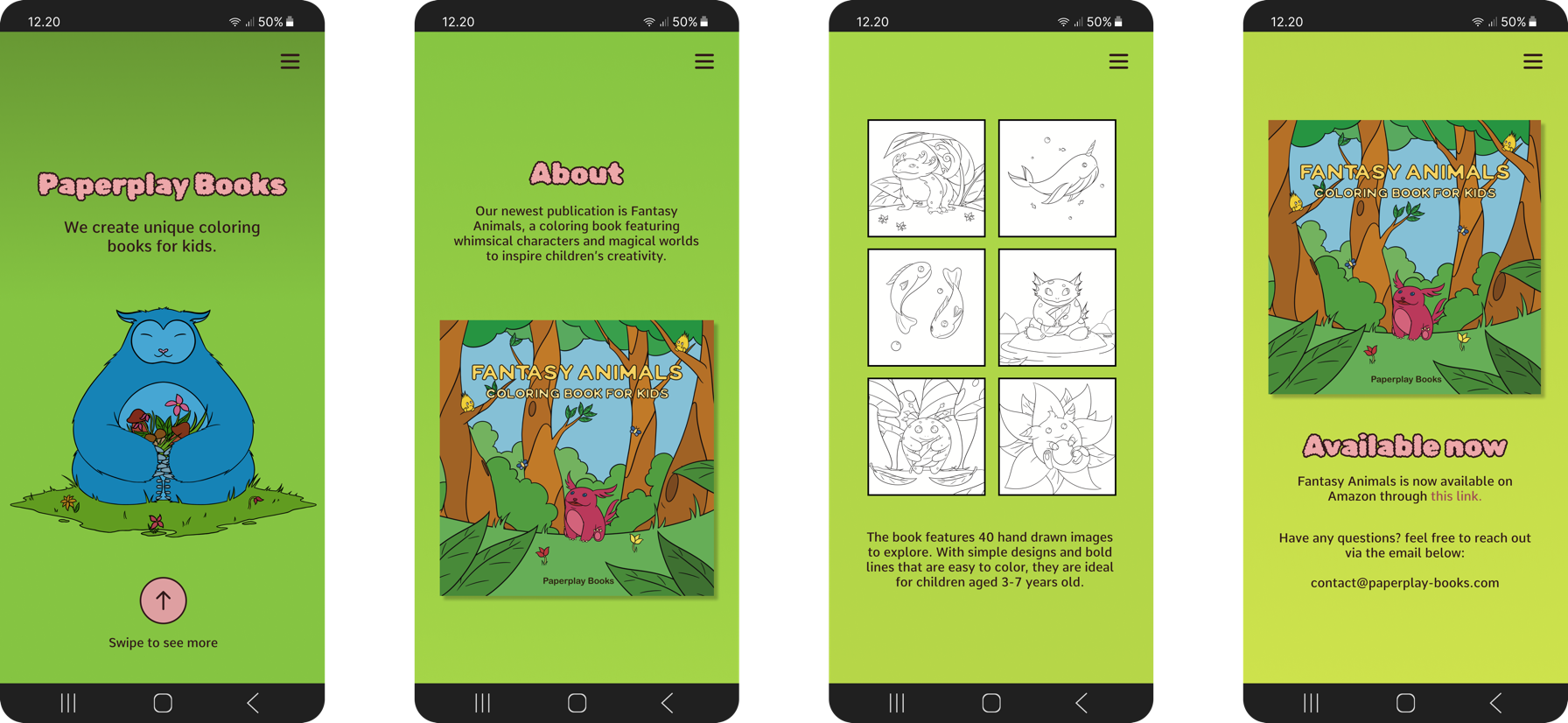
To start off the process, I created some sketches of the interface and what information should go where. Afterwards, I created some wireframes for the UI to get a more precise layout. The structure of the page was kept simple with just four screens and minimal navigation, since its objective is to lead users in a straight path to viewing the product at the end.
This page is meant to sell a product for kids, but the people viewing it are going to be parents looking to buy a colouring book for their child. So while the visual design needs to be kid-friendly, the information on the screens and the interactions are tailored more towards adults.
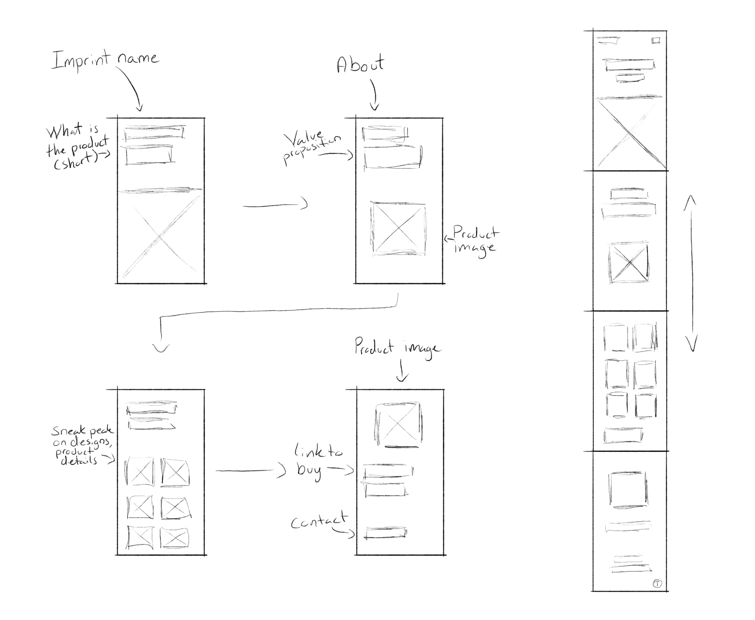
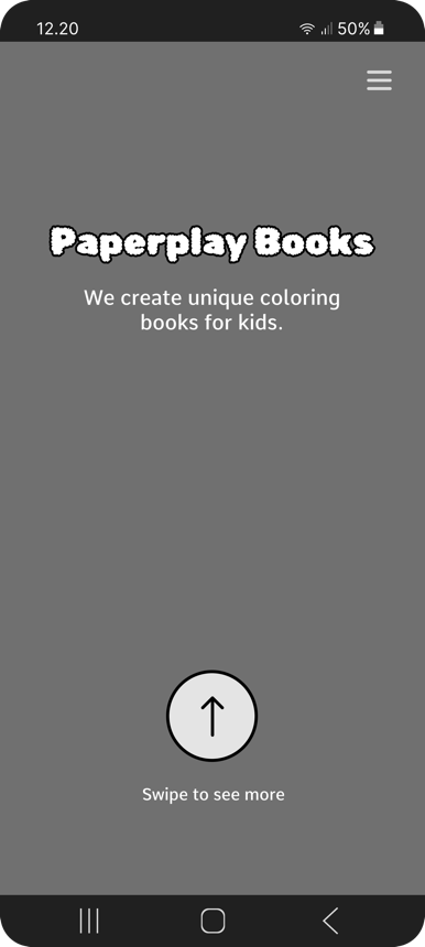
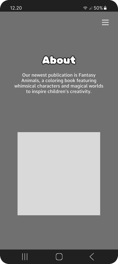
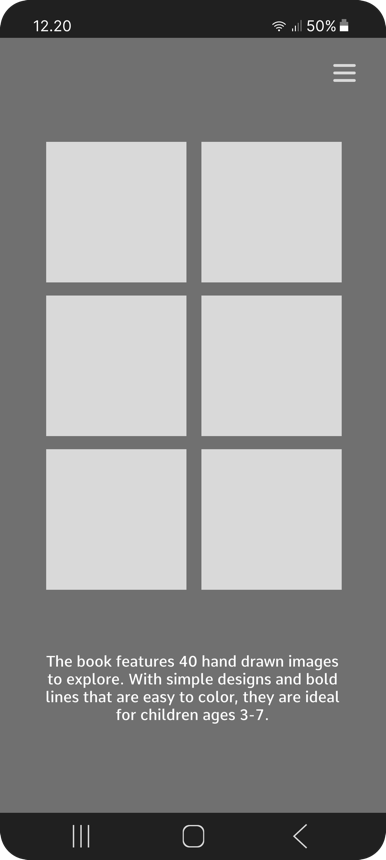
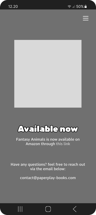
Information about is split into four parts: the name of the imprint and what they do, the newly published book, more details about the book and who it’s for, and, finally, where it can be bought.
Visual design
The illustrations in the book make use of strong, black lines so that they are easy to colour. To make sure that the landing page matched the book, I incorporated this into the UI design. I also used illustrations from the book to bring the landing page to life, and give users a better idea of what to expect from the book.
#A7D648
#669633
#B7D648
#CFE34D
#EDA7A9
#DE9FA1
#301819
Fonts:

- for headlines

- for paragraphs
UI:


To help navigate
Menu for quick access